
Project Summary
I created the vision to minimize the elements and make the table the focus of the interactions.
My Role
Goals
Decrease task time
Reduce user frustration and errors
Reduce customer frustration
Create a more useable experience
Outcomes
Tests with in-row UI vs static button in upper right on tables showed a reduction task times and described as "more obvious" by participants
Eliminated the ability to make errors in the task flows until the point of the client questionnaire form
Tools & Methods
Adobe XD (wireframes, prototypes, pattern library, and file hand-off feature)
Interaction design a major focus
Heuristic evaluation
Task testing
Getting Started
I began the project with stakeholder interviews to learn about the product, users, and the tasks of users.
More modern and branded interface with reusable components
Desktop only platform - responsive design was not a requirement
Improve usability for admins and customers
Customers were already familiar with the lingo
Customers wanted to see as much data as possible
No new functionality could be added / front-end changes only
Heuristics Findings
Opportunities to optimize space
Most buttons/actions are not applicable at this point
Actions could not be applied if tasks weren’t done in a particular order
Content below the requisition table was not relevant to the task
Table data was the intended starting point
View customization was minimal
New Approach
Reduce errors
Add customization
Minimize UI elements
Create a clear task flow
Draw attention to the table
Dynamically display calls to action

The Redesign
Simplified interface
Eliminated chances of errors
Accessible table settings
In-row and slide-outs UI

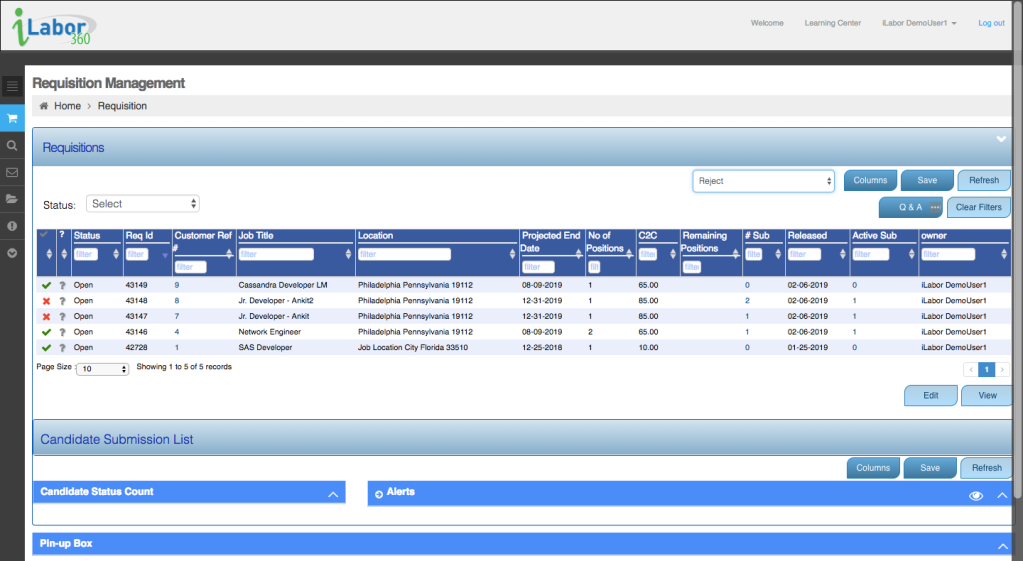
In-Row UI
Action buttons were originally placed the in the upper right of the table. Testing revealed some users lacked confidence that the button applied to the requisition and instead thought it might be applied to the table. I also noticed it took most participants about 2 seconds to locate the buttons on the page.
In-line editing was my inspiration for exploring in-row UI. Task tests showed a decrease in task time and participants felt confident the in-row UI applied to the requisition selected in the table row.

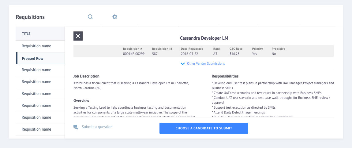
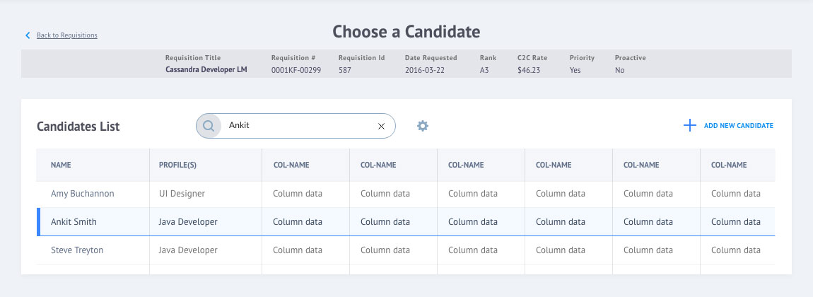
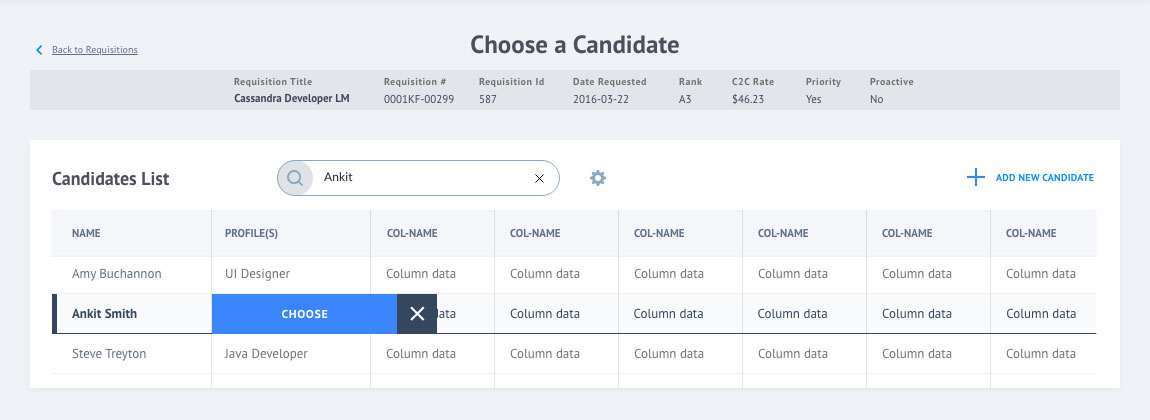
Slide Out Row-to-Detail UI
I wanted to make exploring multiple requisition details quick and seamless. The slide out UI allows users to view the requisition details without leaving the table. It's essentially a pop-up that slides out from the right side of the table that includes an option to choose candidates to submit.

Making Successes Known
Success message modals were added to provide users with confirmation they were successful with their tasks.
Batch candidate submissions were considered new functionality that was out of scope.
